
A small selection of Photobooks from those damp little islands
There is this group of islands off the coast of northern Europe – roughly divided into England, Ireland, Scotland and Wales – where sometimes it is extremely beautiful and sometimes it is merely compelling in it’s bland ordinariness. At other times these islands are bleak and gritty and yet still other times they are mysterious and ancient. Here is a small sample of photobooks from those damp little islands:
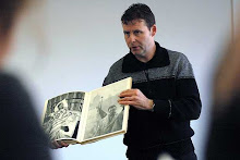
 Here comes everybody, Chris Killip’s Irish photographs – Chris Killip
Thames & Hudson, 2009. 96 pp., 121 illustrations, 78 in color, 13x9½".
Chris Killip is one of the most influential photographers, curators, and teachers to come out of the United Kingdom. His images of the northeast of England in the late 1970s and 1980s powerfully evoke the human disaster of de-industrialization and Thatcherism. They formed part of a body of work by a generation of photographers including Paul Graham and Martin Parr that firmly established documentary photography within an artistic context.
'Here Comes Everybody' is a phrase that echoes repeatedly in James Joyce's Finnegan's Wake, and as such it aptly captures the intense poetry of this new collection of photographs taken over repeated trips to Ireland between 1993 and 2005. On each visit Killip attended the annual pilgrimages at Croagh Patrick and Maamen in the West of Ireland, places of wild beauty and ancient spirituality. His poignant photographs of the pilgrims' trek are complemented by landscapes, townscapes, and details photographed in the West of Ireland and beyond: seaside bathing spots, whitewashing cottages, street scenes, drystone walls, and shrines to the Virgin. These images include the first color photographs Killip has ever published.
'Here Comes Everybody' is a phrase that echoes repeatedly in James Joyce's Finnegan's Wake, and as such it aptly captures the intense poetry of this new collection of photographs taken over repeated trips to Ireland between 1993 and 2005. On each visit Killip attended the annual pilgrimages at Croagh Patrick and Maamen in the West of Ireland, places of wild beauty and ancient spirituality. His poignant photographs of the pilgrims' trek are complemented by landscapes, townscapes, and details photographed in the West of Ireland and beyond: seaside bathing spots, whitewashing cottages, street scenes, drystone walls, and shrines to the Virgin. These images include the first color photographs Killip has ever published.
 London/Wales – Robert Frank
 Photographs by Robert Frank. Text by Philip Brookman.
Scalo, Zurich, 2002. 208 pp., 90 tritone illustration, 9x11".
London/Wales, photographs Frank made during a lengthy visit to the United Kingdom in 1951. The show of ninety photographs from which this book is derived was organized by Philip Brookman of the Corcoran Gallery of Art. This trip predates Frank's searing work in The Americans by several years; his aptitude and discerning eye are in full effect, however, even at this early stage. The photography community's fixation upon the The Americans is broken by this addition, representing a much-needed step towards a fuller understanding of this complex artist.
Robert Franks trip to London in the early 1950’s took him on a tangential journey to the west to visit with the working class miners of Wales.

Who are the English? And what images spring to mind when you think of the English and England? Ask a tourist and they would probably say Big Ben, English 'bobbies', the London Eye or maybe even the Queen. Ask a Scot, Welshmen or Irishman and you may get a different answer. However, ask an Englishman (or woman) and you will probably get more intimate (and printable) answers ...mowing the lawn, going down the pub or maybe braving the beach on a frigid summer's day. Ask Chris Steele-Perkins and he'll have a multitude of answers and what's more, as an internationally acclaimed and award-winning "Magnum" photographer of 40 years standing he has the images to share. In his new book, Chris presents a sweeping, unique record of what he thinks makes England truly English. From Sunday cricket matches to snoozes in a deckchair; intimate family portraits to carefree children at play; circus shows with performing bears to the wilder performers of a street carnival; and from Saturday night dancing to race riots. Each picture tells a story of time and place and many of the images collected will strike a chord or a memory in the viewer. These natural and authentic photographs are a personal selection of the best and most important of Chris's images that he has taken over 40 years of photographing in England. Some are drawn from books he has made on English themes, others from stories he has worked on, others from pictures of family and friends, from random events encountered. This book is an honest testament to this odd but magnificent country that is England, the England of the people.
A 40 year accumulation of images on the theme of England from the canonical magnum photographer Chris Steele-Perkins.
 In Flagrante – Chris Killip
Killip, Chris
Publisher Errata Editions
ISBN 9781935004394
Chris Killip’s 'In Flagrante' is often cited as the most important photographic book on England in the 1980s. Published in 1988, this work portrays the steady decline of communities in Northern England – former manufacturing powerhouses that were gradually compromised by the policies of Margaret Thatcher and her predecessors from the mid-1970s onward. Killip’s black-and-white photographs provide an unflinching look at these disenfranchised northern towns and the poverty visited upon them by deindustrialization. Books on Books No. 4 reproduces Killip’s work alongside John Berger and Sylvia Grant’s original essay plus a specially commissioned essay, "Dispatches from a War Zone," by photo historian Gerry Badger.
108 p, ills colour & bw, 18 x 24 cm, hb, English
The original of this book is rather expensive and hard to come by – thank god for Eratta Editions. This is the landscape and the people of Thatcher’s ugly and vile era.2/2 - Chris Killip: What Happened Great Britain 1970-1990 from LE BAL on Vimeo.
 Josef Koudelka: Reconnaissance Wales
Ffotogallery, Cardif, 1999. Unpaged, 16 duotone illustrations, 11¼x9¼".
With very limited availability, this rare Koudelka monograph is destined to become very collectable. In Reconnaissance, the longtime Magnum photographer continues his panoramic camera work, creating a dark, lyrical, and compelling view of the Welsh countryside. Unique and beautifully printed, the book is designed as an accordion-fold with spectacular double-page images and an illustrated index.
With very limited availability, this rare Koudelka monograph is destined to become very collectable. In Reconnaissance, the longtime Magnum photographer continues his panoramic camera work, creating a dark, lyrical, and compelling view of the Welsh countryside. Unique and beautifully printed, the book is designed as an accordion-fold with spectacular double-page images and an illustrated index.
Koudelka’s panoramic work depicting the dark, lyrical, and compelling Welsh landscape. Filled with beautiful imagery. I wish the cover was more interesting. . ., see for the album ...
 Isle of Man: A Book About the Manx – Christopher Killip
 London: Arts Council of Great Britain, 1980. First edition Wide paperbound quarto. Preface by John Berger. A photographic monograph on the people and localities of the Manx. A gorgeous fine copy in bound photo-illustrated wrappers. With 69 pp of text and photos followed by a section of reference information. Early and beautiful work by Killip.
Isle of Man native Chris Killip explores the places and peoples of this harsh and ancient homeland. See for the album ...
 Bruce Davidson: England/Scotland 1960 – Bruce Davidson
 Photographs by Bruce Davidson. Essay by Mark Booth-Haworth.
Steidl, Gottingen, 2006. 192 pp., 120 tritone illustrations, 9½x10½".
In 1960, after spending an intense year photographing a notorious Brooklyn street gang called The Jokers, Bruce Davidson decided that he needed to get away from the tension, depression, and potential violence connected to that work. He took on a commission to photograph Marilyn Monroe during the making of John Houston’s film The Misfits in the Nevada desert, and then traveled to London on a commission for The Queen magazine. Edited by Jocelyn Stevens, The Queen was a magazine devoted to British lifestyle and Davidson was charged, with no specific agenda, to spend a couple of months touring England and Scotland to build a photographic portrait of the two countries.
England/Scotland 1960 offers a visionary insight into the very heart of English and Scottish cultures. Reflecting a postwar era in which the revolutions of the 1960s had hardly yet filtered into the mainstream, Davidson’s photographs reveal countries driven by difference-the extremes of city and country life, of the landed gentry and the common people-and lucidly portrays the mood of these times in personal and provocative imagery that is as fresh today as it was in that time. Published in this book for the first time in its entirety, this is one of undiscovered gems of late 20th-century documentary photography.
Bruce Davidson spent two month in 1960 recording the peoples and places of England and Scotland. This is the book of that experience which was finally released in 2006.
 British Photography from the Thatcher years – Susan Kismaric
Catalogue from an exhibition that opened at MOMA, New York, on Valentine’s Day 1990 displaying documentary images of Britain under the regime of the ‘milk snatcher’. See for the album ...
 The English at Home – Bill Brandt
The English at Home by Bill Brandt
First Edition, First Printing, 1936
This is a scarce first edition, first printing of the classic photobook, “The English at Home” published by B.T.Batsford, Ltd., London in 1936. “The English at Home” was Brandt's first published collection of photographs and provides a unique insight into the extremes of British society between the wars. In the mid-1930s such photo-journalism was very rare and the unsettling social questions raised by Brandt's photographs rarely discussed. Although not initially well-received and quickly remaindered, “The English at Home” is now seen as a rare example of artistic photojournalism. Brandt favored pre-arranged to candid pictures, giving his work a cinematic and often surreal quality. Commenting in “The Book of 101 Books: Seminal Photographic Books of the Twentieth Century”, David Levi Strauss wrote, “'The English At Home' may look like a fairly conventional self-congratulatory celebration of 'the English'...[but] as the book proceeds, the strictly divided class structure of England is increasingly reflected in the layout, with an image of a desolate street...juxtaposed with children in fine clothes looking bored...and a group of upper-class Brits in top hats and tails at the races contrasted with a mother and her three children in a dirty, cramped room in a village of East Durham in Northern England.” Brandt became a regular contributor to Picture Post and Harper's Bazaar and was famously commissioned by the Ministry of Information to photograph life in the London Underground bomb shelters during the Blitz. His uncompromising style and eye for detail made Brandt one of Britain's most influential and internationally admired photographers of the 20th century his work influencing Robert Frank among others.
Containing 63 gravure plates and measuring approximately 9” x 7.5”, the book is bound in photographically illustrated laminated boards and has photographic endpapers, each being a double page image. The book is in Near Fine condition with sunning to the spine and a rub to the bottom left corner of the upper board without the glassine dust jacket as issued. Overall, this is an excellent copy of a notoriously fragile and highly sought after ground breaking photobook rarely found in this condition.
Cited in all three reference books on photobooks: “The Book of 101 Books: Seminal Photographic Books of the Twentieth Century” by Andrew Roth and “The Photobook: A History”, by Parr and Badger, and “The Open Book” by Andrew Roth.
Classic depiction of the sublime and quiet horrors of the English class system. The Battle of Waterloo Road – Robert Capa
 An extensive photographic essay of London during the blitz described by the celebrity photojournalist and champagne socialist Robert Capa.
 Megaliths – Paul Caponigro
 Ancient structures from 5000 years ago are to be found all over these mysterious islands (and they even extend over the English channel to those folks in Brittany).
 The Donegal Pictures – Rachel Giese [with poems by Ciaran Carson]
A book of images of the everyday lives of villagers from an Ireland of long ago. These photographs are bathed in a sensual light.
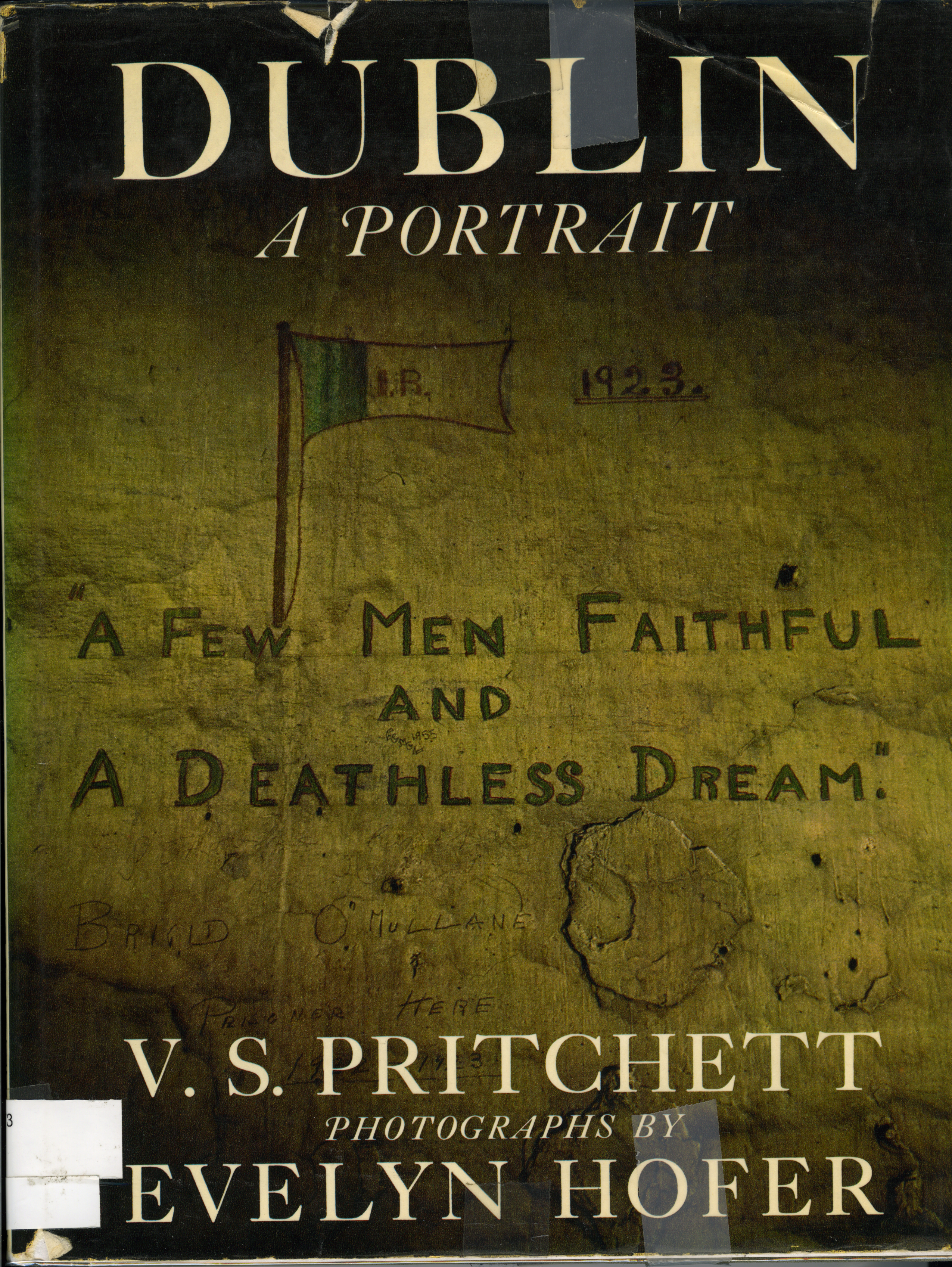
 Dublin, A portrait – Evelyn Hofer
This is remarkable documentary work of a Dublin past. I especially love the beautiful image of the four sporting fellah’s from Phoenix Park on a Sunday. See for the album ...
 Tair a’ mhurain: Outer Hebrides – Paul Strand
Paul Strand, Basil Davidson: Tir A'Mhurain. Outer Hebrides. Photographs by Paul Strand. Texts by Basil Davidson and Catherine Duncan. VEB Verlag der Kunst, Dresden, 1962. Quarto. First German edition (with text in English)*. Clothbound in photo-illustrated dust jacket. 105 gravure reproductions.
EDITION NOTE: A German language edition of Tir A'Mhurain from the same publisher was issued; this English language edition, published in Germany by the same house is, thus, likely part of a very small print run.
"The decision as to when to photograph, the actual click of the shutter, is purely controlled from the outside, by the flow of life, but it also comes from the mind and the heart of the artist. The photograph is his vision of the world and expresses, however subtly, his values and conviction."--Paul Strand.
For three months in 1954 Strand and his wife Hazel traversed the island of South Uist, off the west coast of Scotland. A Paul Strand classic, beautifully printed in gravure!
Paul strand’s glorious images of the island of South Uist where he spent three months in 1954. See for the album ...
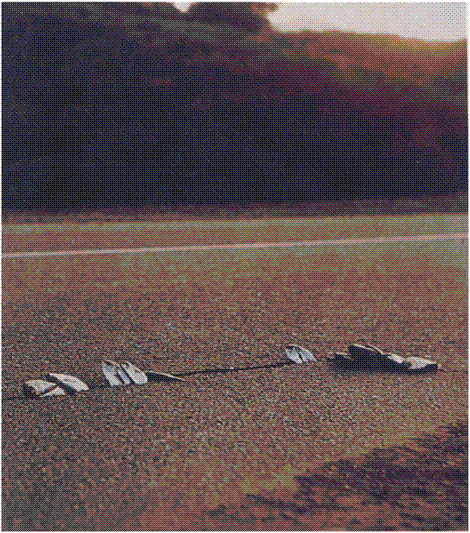
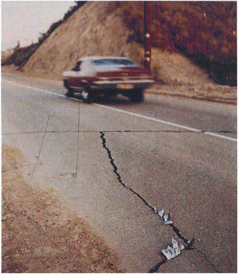
 A1: The Great North Road – Paul Graham
Paul Graham describes in colour the A1 Road which links London to Edinburgh and illuminates all the places in between.
Paul Grahamn - A1: The Great North Road from Photobook Club on Vimeo.
 The British Landscape – John Davies
John Davies surveys the landscape of Britain with great solemnity and brings the ordinary to life in a large and dramatic way.
 Hackney Wick – Stephen Gil
Photographs by Stephen Gill.
Nobody., London., 2005. Unpaged, 8¾x8¾".
"Hackney Wick sits in East London between the Grand Union Canal, the river Lea and the Eastway A106. I first came across the area in January 2003 when I was photographing the back of billboards. Although I had lived in London for nine years and thought I knew east London well, Hackney Wick threw me; it completely changed my mental map of this part of London." Stephen Gill
 LDN – Antony Cairns
These streets and buildings strip-lit spotlit smudged and smeared and looking up to space and shadow and night-time silence and some concrete corner we remember and forget and remember again are fragments of memory touching other memories of cold city corridors where people live but none are seen in the hours of subway haunting and drifting over high rise and low rise.
Now the lens is a power drill in the hands of a chimera. The target missed reveals the ante-chamber behind the subject which is a mysterious place we can all enter. Walk through central London late at night and you will sense this space. Don’t linger but be aware that horror will emerge from an unexpected source.
Now the lens is a power drill in the hands of a chimera. The target missed reveals the ante-chamber behind the subject which is a mysterious place we can all enter. Walk through central London late at night and you will sense this space. Don’t linger but be aware that horror will emerge from an unexpected source.
LDN3, the third of Antony Cairns’s LDN books, expands upon his vision of a nocturnal concrete London lit by glaring lights from windows of unseen rooms in looming buildings. A sense of movement pervades, a sense of the reader as passer-by in a strange landscape, drawn away through the dark labyrinth of night without discovering the secrets concealed in those rooms, on to the next bleary edifice and on again, only to realise at last that what we see is home.
 Our True Intent Is All For Your Delight: The John Hinde Butlin’s Photographs – John Hinde.
Butlin’s Holiday Camps are a unique British institution conceived by Billy Butlin for post-war Britain. He dreamt of a holiday centre for the great mass of working-class families, where they could have a good time irrespective of the unreliable British weather.
In the late 1960s and early 1970s the photographer, innovator and entrepreneur John Hinde, a key figure in the development of the colour photograph as a postcard, set about recording the ‘social revolution’ that was Butlin’s. Hinde’s postcards not only provide a valuable documentation of the Butlin’s phenomenon, but an account of the rise of leisure society in post war Britain. Set apart from the more romantic, black and white documentary images of Britain at that time, these images have been overlooked by the history of photography. This exhibition provides an opportunity to re-assess their importance.
Through the bold use of colour throughout the frame, cutting edge printing techniques and his use of props and narrative content, the Hinde postcards quickly established a competitive advantage over rival manufacturers. In the 1960s Hinde’s success attracted the attention of Billy Butlin who commissioned him to develop a range of colour postcards of his holiday camps. By 1965 Hinde had given up doing the day-to-day photography himself and was using the young German photographers, Elmar Ludwig and Edmund Nägele, later joined by the British photographer David Noble.
Following an exhibition from the archive of Hinde’s work in 1993 at The Irish Museum of Modern Art in Dublin, this is the premier touring exhibition dedicated to the Butlin’s photographs.
Photographs by Elmar Ludwig, Edmund Nägele and David Noble
Exhibition curated by Martin Parr
Produced by Chris Boot
In association with Les Rencontres d’Arles
Images filled with ‘fun’ from the leisure industry ‘holiday camps’ of mainstream Britain recorded in their heyday during the 1960’s and 1970’s.
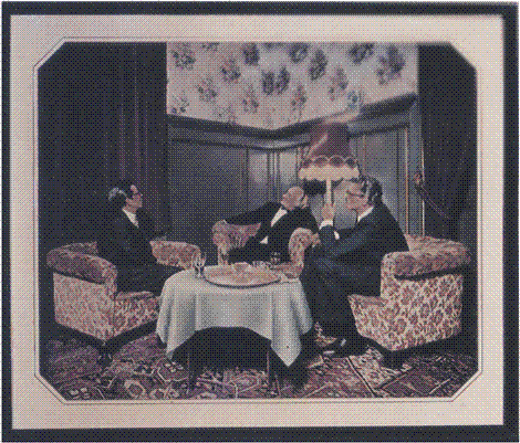
 The Cost of Living – Martin Parr
This is a colourful look at the intricacies and complexities of British social life from the legendary documenter of the intricacies and complexities of British social life Martin Parr. See for the album ...

Martin Parr, Election party aboard the SS Great Britain from The Cost of Living, 1986-9
The Britain of the 1980s wasn’t all about strikes and unemployment of course. There was another side to the story: just as there were the have-nots, so there were the haves. For some, Thatcher’s Britain was a comfortable place. The rich were, after all, getting richer. And with that, for those who belonged, came the social whirl of an entitled class at play. In fairness, it doesn’t look like much fun.
In The Cost of Living, Martin Parr captured the comfortable lives of the well-heeled revealing the degree to which one section of the population was cushioned from the day to day reality of life for the rest and the often grotesque of culture of wealth and upward mobility.

Conservative ‘mid summer madness’ party, 1988
Just as I wouldn’t want to wait for hours on end week in, week out in the dole offices documented in Paul Graham’s Beyond Caring, I’d hate to spend time at most of the events Parr recorded.
It’s not just that the pictures are now period pieces – a reminder of a different time – it’s that neither the people nor the places look like much fun. There is a grim determination to, well to what? To network maybe? To keep up appearances? To support the cause? To pass as belonging? Though many of the pictures are of parties, there seems to be more evidence of anxiety than of enjoyment.
 Young Conservatives’ Ball
The Young Conservatives look conservative, certainly; but only some of them look young. And if this is a ball, then I’ll take a pint in the pub any day. In part of course it’s that this is somewhat alien territory. My background and life experience maybe firmly middle class but I’m pretty sure I couldn’t have blended in and passed for ‘one of us’ at any of these events. In the main though the grotesqueness is down to Parr’s picture-making. The camera angles, use of colour and Parr’s trademark use of fill flash all conspire to build a gloss of unpleasantness. The upwardly mobile, frozen in the moment

Clifton College Summer Fete


